Purpose:
Soon after the separation, we received new marketing goals from our investors who had just come aboard.
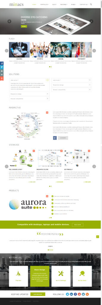
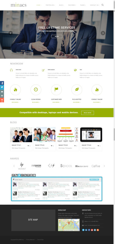
Their focus was to develop a best-in-class website that is visually high on colours and pictures. The website needed an overhaul in content, messaging, and a strong digital presence to drive better lead generation.


Approach:
We approached this project a bit differently. We first identified the list of competitors, latest website trends, and best practices.
We introduced new colours that were added into the colour palette. We emphasized in building the company’s brand messaging that not only appeared on the website but everywhere! Even on printed collaterals across the company. To simplify and maintain the consistency of this style, we selected out-of-the-box images that made us standout amongst our competitors.

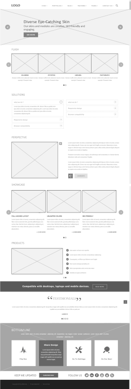
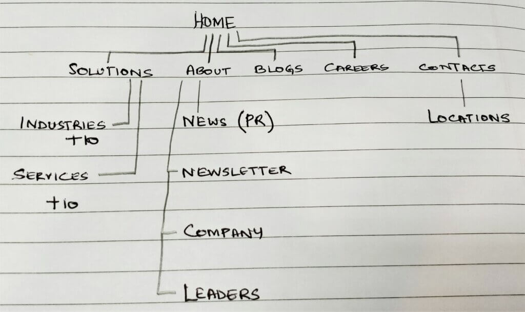
We used latest website techniques like global navigation, persistent navigation, parallax bookmarking, full page panels, social sharing, easy to access inquiry forms. These features were new for services websites then and we were the proud flag bearers for some!
We used subscribe and cross-links to drive more traffic into our campaign pages, carrying free and behind-the-wall collaterals which could be viewed/downloaded on submission of a simple form.
This website was also designed responsive that helped us standout in a period when our competitors were only made for higher resolution, computer screen displays.
Evaluation:
During the test we identified that we had simplified the navigation leading to quick accessibility and easy form submissions. This concluded that we met our brief and achieved what was required by the business.


3X growth in leads
More SQLs than target
High average sessions
Lesser bounce rates
Higher conversions on campaign pages
Increase in newsletter subscriptions
High returning visitors
