
Purpose:
The website now received 80-90K visitors every day. We wanted to make the website easier to navigate, faster to load, and quicker to raise inquiries. In terms of design, the website needed a modern look with totally new messaging.
Approach:
As our first step, we identified the most visited pages and how one could interact with our visitors better. We decided to approach this with a mobile-first design strategy and bold messaging style. This idea was to promote interaction with our young visitors, mostly the millennial!
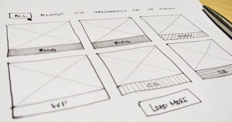
We simplified our solution and industries pages, and used the pillar pages strategy to make two major pages. “Portfolio” that would display all the services, and “Clients” that would contain case studies, primarily highlighting results and solutions.
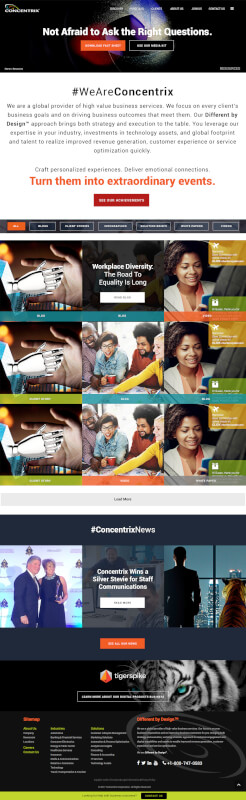
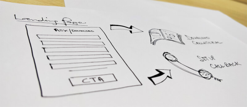
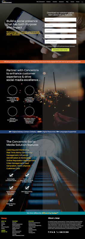
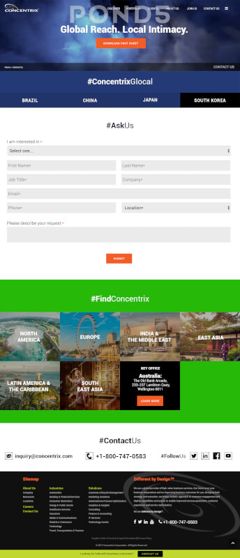
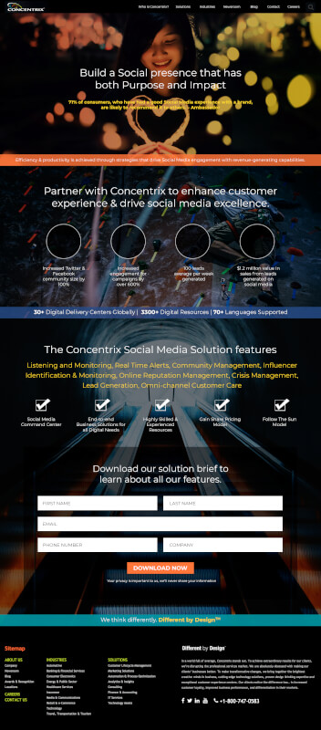
This approach reduced the number of pages (18 – 2). The sub-pages (cluster pages) would be independent, temporary, and regularly validated. These pages were to be used for social and direct marketing campaigns. They would be archived every 6 months, unless required for any event campaigns. During these few months, the pages would capture leads using the respective forms (comment, feedback, inquiry, subscription). We had noticed from our research that our visitors are seeking meetings with our executives, therefore, “Schedule a meeting” calendar facility was proposed. This would allow the visitor to choose a suitable slot. For every form submission, we set up a response team that would reply suitably in 24hrs.
After several mock-ups and versions, some versions became hot favourites of the senior executives. These were promptly implemented.
This was a 90 day project, where we had already spent ~60 days in research, card sorting, information architecture, wireframes, approvals and then in building high-fidelity prototypes. During this time we also built a campaign calendar that would drive the social and direct marketing traffic onto the website.
Evaluation:
During the testing period, we noticed that most of our users were staying longer on the website, but accessing more pages than before. The simple navigation also helped in quicker form submissions.
We also developed content/collateral that would appeal to millennials and drive their interest. Since this was a larger project for the content team, the deadline was pushed till further notice.
-
10% increase in form submissions
-
40% increase in Avg. session durations and pageviews per session
-
Regular updates would improve SEO and engagement
-
Page load speed increased by 3X on desktop and mobile devices